Plotting a CDF in Excel
Cumulative Distribution Function
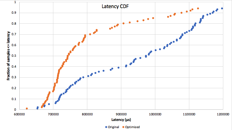
November 02, 2018One of the most useful kinds of charts in my work is a Cumulative Distribution Function. Here's an example.

In addition to showing the median and any percentile one mightwant, this conveys a lot of information that simple numbers can't. See how the orange line diverges from the blue one and then starts to converge again, or how the orange results are heavily clustered on the left with relatively few outliers? That's all interesting information. This was an unexpectedly good result for the experiment I was doing, by the way. I'll write more about that some day, if I'm allowed to.
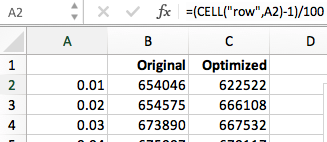
Unfortunately, this is not a type of chart that's well supported in most software, including Excel. There are some tutorials out there, but they mostly seem to be about using standard distribution functions to approximate the actual data. What I wanted was an exact representation of the data I had just gathered, so I had to experiment a bit and I figured I'd share what I found with others. Here's a picture of the spreadsheet to illustrate how I did it.

As you can see, the first thing you'll need is a sorted column of data - either "original" or "optimized" above. These are going to be your X values. For Y values, you need a simple series of fractions from zero to one. One easy way to do that is using the CELL function as shown. Put it in one cell, then copy it to the others. It's important to include the row/column as the second argument to CELL, or else the copy/paste won't work right.
Now you're ready to create a chart. Select the data for both columns and insert "X Y (Scatter)" chart, then edit the series. Here's what I used for the "original" data.

Notice how the X/Y values are columns B and A respectively. For the "optimized" data I used columns C and A. The rest was just standard Excel formatting stuff to limit the range, add axis labels and a legend, etc. In the end it's really pretty easy, but it seems like it shouldn't even be this many steps. Why isn't CDF a built-in chart type?